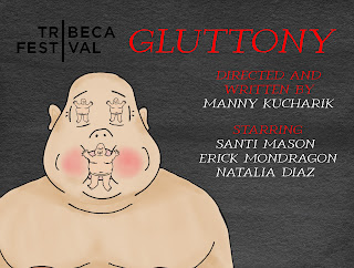
As of today, I managed to pull together a final product based on this mock-up. Here is the front.
I naturally found it fitting to give the man more details and color him in. Even though the big man and the smaller mouth and eyes men are kind of cartoonish, I don’t think it really takes away from the piece’s effectiveness or delivery of its theme. I found that darker color matched with the darkish tonality of the piece and as such incorporated black and crimson red for the titles(the white is kind of just a contrast to the black.)
I didn’t plan this side like I did the front, but here is the back of my postcard.
This background graphic is a turkey leg with a big, ugly eyeball. Though it’s simplistic and once again very cartoonish looking, the meaning one is meant to deduce from imagery like this makes it a fitting choice. The eyeball being on the turkey leg is almost like saying that we consume what we see/ are exposed to in the same way that we consume food. Aside from the graphic, I have the dates for the Tribeca film festival showings on this side together with the social media. I was originally just going to put the Twitter account because that's the only real promotional social media, but I also figured that I would upload the full film to Youtube eventually so my friends could see.
Now with the postcard done, I AM FINALLY DONE WITH EVERYTHING!! REFLECTION AND FINAL POST IMMINENT!!


No comments:
Post a Comment