OH MY GOD ITS TIME HERE'S MY FINAL PRODUCT!!
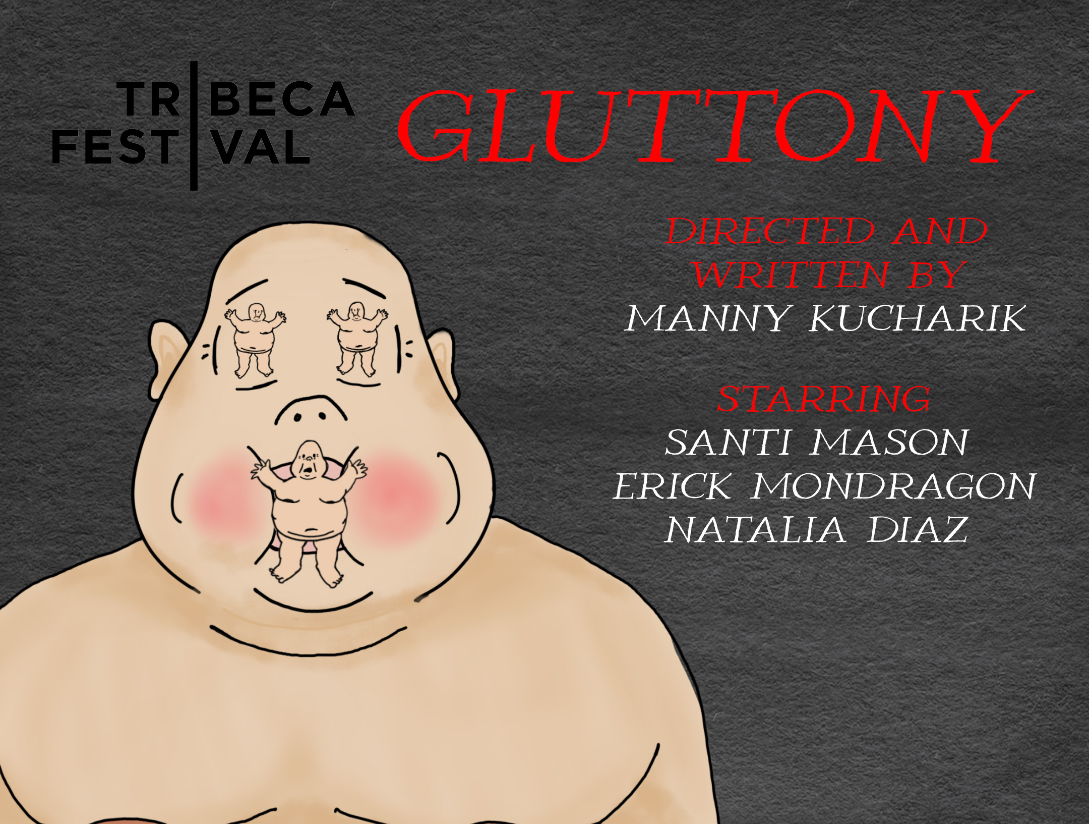
FILM FILE
POSTCARD


SOCIAL MEDIA


Gluttony is one of the seven deadly sins, and one of the most enabled by today's society. In my film, entitled GLUTTONY (naturally), the idea of gluttony is assessed on levels past just shoving food into your mouth, namely the modern application regarding people overexposing themselves to media.

The idea for GLUTTONY came to me a few weeks after I watched Darren Arronofsky's The Whale in the theater back in December of last year. The tragic and simultaneously horrifying nature of having a stress-induced eating disorder resonated with me extremely hard, and it truly gave me a new perspective on the nature of people with such problems. While the crux of my film wasn’t exactly to point out the humanity in such a monstrous figure of a man like The Whale, I used certain elements from the movie to build the character I nicknamed Fat in the production process(the character was never granted or credited with a name in my piece.)

The tonality of my piece differs greatly from the tone of The Whale, as the film used the protagonist’s(Charlie) eating disorder to make the viewer feel bad for him, but I aspired to do so in a way that looks down on it. At the heart of my piece, all of my characters have flaws and the question is not whether they should or can be redeemed, it’s more about who has the MOST/WORST flaws. That being said, the opening of my film takes direct inspiration from the scene in The Whale when Charlie battles his inner voice taunting him with a Twix bar and loses, scarfing down the candy in a grotesque fashion.

Before I initially latched onto the idea of looking down on “gluttonous people,” I was hesitant to take on this theme because it could possibly backfire and be misinterpreted as a shot at people who have eating disorders or truly cannot control themselves when overindulging in something. Though I was scared to make my food gluttony character unlikeable at first, I thought it would be cool to have the character be conditioned to believe that he has an issue, leading the audience to believe that he will interpret his bullying as a means for change, but then misdirecting them by having him succumb to it and go even deeper with it in spite of himself and the ones who bullied him. In writing him this way, I could have the character lose the moral high ground in the situation to make the audience lose their connection with the character itself and more the idea that all three characters weren’t anyone to sympathize with.

While I would say the opposite for “Fat,” I was TOTALLY taking a dig at people who use social media or their phones too much with the character of Medea. As aforementioned, I never wanted people to look up to or seek asylum in any one of my characters being any good, I hoped they would find power in putting down the distinct yet similar types of evils within my characters. For Medea, her evil is constantly hinted at throughout the entire piece, as she stares dead into the computer and really only contributed to the conversation when she was reminded of a movie she watched. She was always meant to be a highly exaggerated version of people who are chronically online, and as such I expected viewers who could possibly relate to this character to reflect and understand that their overindulgence is just as gluttonous as people who eat too much.

Building on the first of those two reasons(totally the most important one😳), I made the marketing centered around her so audiences could possibly go in focusing on that character in particular. To be specific, all the posts from the Twitter account for the film(except for the final promo) are from the perspective of Medea herself. I started off by posting all the characters in the piece in the order of their screentime and then twisted the final post with Medea to say “me” instead of her name/adjective given to her(FAT AND EGO ARE NOT ACTUALLY THEIR NAMES.) The tweets to follow are from a first-person perspective, just like any standard Twitter account, I would post and repost the kinds of things she would say or feel attached to if she were real, like the Mario movie, for example.

This tweet is possibly the most direct way I attempted to engage with the Twitter base in my marketing, asking them a genuine question from the POV of the character. Other tweets, like Medea’s living room and the “I look cute in this” tweet were both clever little ways to tease what viewers would see in the production itself. Trying my hardest to tweet like any Twitter user, I hoped they/potential fans would find the level of interactivity and role-playing to be a cool way to promote the film.


After finally being able to say I have wrapped production on Gluttony, I feel that same bittersweet feeling as the last time I charted my entire production process. The struggle and stress of brainstorming and thinking everything out is dehumanizing, but it really does make the final payoff seem all the more special. I hope you enjoy my film, because I enjoyed finishing it(less making it.)


.jpg)
My experience editing this project was much more complicated than it had to be, more so than I have ever made it before.
In my last post, I said I would use iMovie to edit rather than premiere because of time reasons and because I was curious to see if it really was as bad as I'd heard. I was not regretting my option while editing, it honestly wasn't that bad, but there were certain perks from Premiere that I was really missing from Premiere. Among these perks are the ability to separate clips at any rate I wished(iMovie smashes every clip in the timeline together) and the obvious one, keyframing. The entire title sequence and credits were impossible to make in iMovie(in the way I wanted it to look,) so I cut my losses and used one of iMovie's crappy title fill-ins to make my title sequence...
No, I didn't. Nobody should ever do that.
I edited as much footage as I could in iMovie excluding the Title sequence and the end credits before exporting and shooting it into Premiere to do those two things. While I was there, I had some sort of creative explosion in my head and ended up keyframing a ton of stuff, fixing sound problems to playing with lighting effects and opacity. I also decided I wanted to insert a few voiceover lines to fix some bad line deliveries from my actors, and I edited those up real nice to sound as natural as possible.

As for the title, I found a font that I thought complimented the piece pretty well. The font is called "ROMANA" and it's really big and fat. I felt like the idea of overindulging/stuffing yourself was communicated in the chunky line width of the font, so I ended up using it. I will use the same color and font on the postcard I have in the works.
The editing of this project is something I'm fairly proud of; it's not anywhere near some masterclass editing job but it did the narrative justice. I was way less confident in my footage going into the editing job, and once I finished editing I feel kind of stupid for thinking it was irredeemable.

The only real alternative would be iMovie, as it's the software I am the second most versed in(second to Premiere.) To many, it is the poor man's Premiere, having vastly less effects and a much simpler way to organize clips. In this case, simpler means worse, because it limits the editor in what they can do. However, what about when there is no need to go that hard at all? Is it worth going with the easier option if all I need to do is easy edits? In my eyes, the answer is yes.
For the first time in my editing career, I am consciously demoting from Premeire to iMovie to edit a professional project. It sounds kind of stupid to declare it, but this rationalization poses a fairly convincing argument for making the change. Hopefully I won't regret it.
So I did end up scrapping everything I had before to shoot everything again. The result?

 |
| Day one shot |
 |
| Day two shot |

OH MY GOD ITS TIME HERE'S MY FINAL PRODUCT!! FILM FILE GLUTTONY POSTCARD FRONT BACK SOCIAL MEDIA TWITTER: @gluttonymovie


